
Why Logo Trends Matter for Businesses, Not Just Designers
In today’s business landscape, first impressions matter as much as anything else. A well designed logo can influence potential customers before they are properly introduced to your business. In 2026, logo design trends are shifting to recognise that a logo is no longer just a visual identifier, but a strategic tool that shapes perception, trust, and credibility from the very first interaction.
Many of the most influential logo design trends in 2026 are driven by functionality and clarity. As customers encounter brands across smaller screens and faster touchpoints, logos need to communicate more with less. This has shifted the focus away from decorative elements and towards strong typography, simplified forms, and systems that adapt easily across different platforms.
Understanding these trends is not about blindly following what looks popular. It is about knowing how design choices influence how your business is perceived, and making informed decisions that support growth rather than short term visual appeal.
With that in mind, the key logo trends shaping 2026 reflect a move towards simplicity that is intentional rather than generic.
Key Logo Trends in 2026
Simple Logos with Intentional Design
In 2026, many brands are focusing on designing with intention. Modern logos often appear minimal at first glance, yet contain subtle visual cues or secondary meanings that reinforce the brand’s message. This approach creates logos that are easy to recognise while still rewarding closer attention.
A well known example is the FedEx logo, which uses negative space to form an arrow between the letters E and X, symbolising speed and precision. While not every logo needs a hidden symbol, this type of thoughtful design demonstrates how simplicity can still carry depth and purpose.
For businesses, logos with considered meaning can strengthen brand recall and storytelling without adding visual complexity. When executed well, these designs feel intelligent, timeless, and purposeful rather than overly decorative.
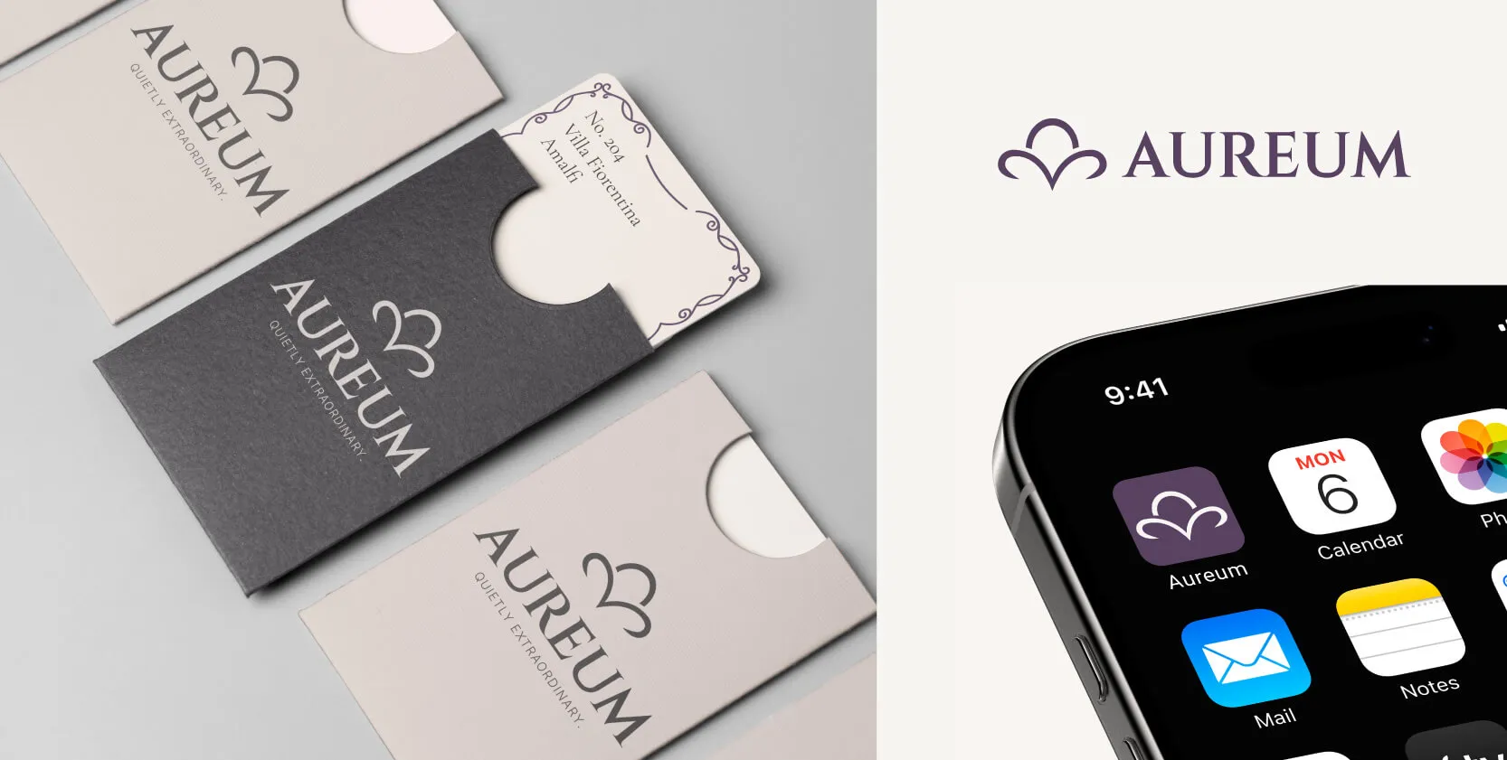
Simplified and Scalable Logo Systems
In 2026, logos are no longer treated as single, static marks. Instead, they are designed as flexible systems or families, made up of multiple variations that adapt to different platforms, formats, and use cases.
A logo system typically includes a primary logo, secondary logo, and a brandmark or iconmark, along with simplified or alternate versions designed for specific applications. As more people interact with brands online, websites for businesses have become a necessity. This makes having a flexible logo system even more important, ensuring the brand remains recognisable at small sizes across digital platforms, while still allowing for more detail or personality when space allows.
By prioritising simplicity within a scalable system, businesses benefit from stronger recognition, improved consistency, and fewer limitations as their visual identity is applied across websites, social media, print, and future brand touchpoints.
Bold Typography and Confident Wordmarks
Typography is playing a much bigger role in logo design in 2026, with many brands leaning towards explorative and confident wordmarks as the foundation of their identity. Rather than relying heavily on symbols, businesses are choosing distinctive typography to carry the brand on its own.
A typographic logo elevates the brand name into the primary visual identifier. Logo design is increasingly exploring custom lettering, variable fonts, and bolder typographic treatments to allow a brand’s personality to come through more clearly. This approach is highly memorable and particularly suited to businesses that want to stand out in competitive markets.
This trend does not necessarily mean using heavy or aggressive fonts. Instead, it focuses on confident typographic choices that feel aligned with the brand’s positioning. Clean sans serif wordmarks continue to appeal to modern service based businesses, while refined serif wordmarks are increasingly used by brands aiming to communicate heritage, quality, or premium value.
For business owners, wordmark logos offer a practical advantage. They are easier to scale, simpler to apply consistently, and less likely to feel dated over time. When typography is chosen thoughtfully, it becomes a recognisable asset that can stand alone or work seamlessly within a broader logo system.
Human, Imperfect, and Hand-Inspired Details
As many corporate logos begin to look increasingly similar, audiences are naturally drawn to brands that feel more human, authentic, and imperfect. In 2026, brand identity design embraces subtle irregularities such as shaky line work, intentional imperfections, and organic shapes to add warmth and character.
These types of logos are designed to feel approachable and are commonly used in industries such as hospitality, wellness, and creative services where trust and connection matter. In these spaces, brands want people to feel welcomed, comfortable, and confident engaging with the business, rather than intimidated by something that feels overly corporate or impersonal.
Hand inspired details and controlled imperfections help reinforce the idea that there are real people behind the brand rather than a faceless organisation. When used intentionally, this approach can make a business feel more relatable and memorable, particularly in competitive markets where emotional connection plays a key role in decision making.
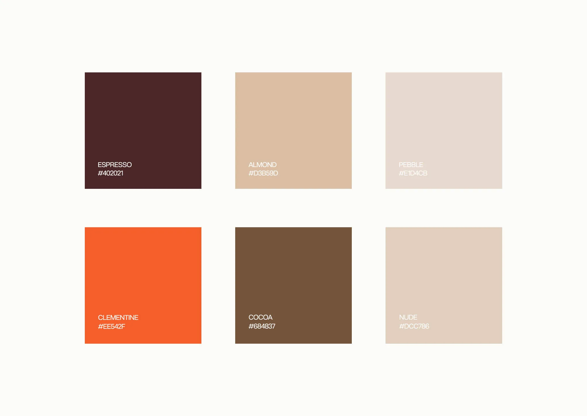
Neutral Palettes Paired With One Standout Colour
Many brands in 2026 are moving away from overly flashy colour palettes in favour of neutral foundations paired with a single standout accent colour. This approach prioritises calmness and balance, allowing brand identities to feel timeless and adaptable while still maintaining a clear point of visual interest.
Neutral tones such as black, white, grey, beige, and muted earth colours create a calm and confident base. When paired with one intentional highlight colour, the brand gains personality without becoming visually overwhelming.
This approach is particularly well suited to premium, minimalist, or eco focused brands that aim to communicate quiet confidence and clarity while appealing to audiences who value simplicity and restraint.
Trends to Be Careful With
While logo trends can offer useful direction, not every trend will suit every business. In some cases, following the wrong trend can do more harm than good.
Over-Minimalisation That Removes Personality
Minimal design can be effective, but when taken too far it can water down a brand’s personality. Overly simplified logos risk looking generic or forgettable, particularly in industries where many businesses already share a similar visual style. A minimal logo should still feel refined, intentional, and recognisable.
Copying Popular Brands Instead of Standing Out
It is easy to look at well known brands and assume their visual style is the right approach. However, copying popular logos or design trends often leads to brands blending in rather than standing out. There is also a risk that your audience associates your brand with the one you are imitating. What works for one business may not work for another, especially when audience expectations and positioning differ.
Trends That Age Quickly
Designing purely around trends can cause a logo to feel outdated faster than expected. While trends can be visually appealing in the moment, a brand’s logo should be guided by strategy, audience relevance, and values. By prioritising intention over novelty, businesses can avoid weakening recognition over time.
Should You Follow Trends or Avoid Them
Whether you’re just launching your business or considering a redesign, logo trends can be tempting to follow. Before deciding whether or not to adopt these trends, it is important to understand that there is no universal right or wrong answer. The decision depends on where your business is right now, where it is heading, and what role your brand needs to play in supporting that growth.
When Trends Make Sense for Growth Brands
Integrating design trends can be useful for businesses that are in a growth stage. This may include businesses launching for the first time, expanding into new markets, or repositioning themselves to compete at a higher level. Because the brand is still forming or evolving, visual trends can help signal change quickly and clearly.
Trends can also help growth brands reduce friction. When a business communicates that its logo feels modern and visually familiar, people are more likely to trust it quickly. This is especially important for businesses that do not yet have strong brand recognition. A well chosen trend can help a brand feel established sooner, even while the business itself is still growing.
For businesses in a growth stage, aligning design decisions with a broader strategy, such as investing in cohesive business packages, can help ensure branding evolves in a structured and intentional way.
That said, trends should be strategically selected and implemented, not followed blindly. Businesses benefit most when the trends they adopt align with their long term direction, audience expectations, and brand values.
When Timeless Branding is the Better Option
Timeless branding is often the better choice for businesses that prioritise long term stability, consistency, and premium positioning. Rather than focusing on what is popular right now, these brands benefit from a design approach that remains effective over many years.
Businesses in professional services, luxury markets, or industries where trust and credibility are built over time tend to suit timeless logo design. A logo that remains consistent rather than being frequently redesigned helps reinforce familiarity and reliability, which are critical for customer confidence.
Trend driven logos can sometimes feel temporary or experimental, which may work for some brands but not for others. Timeless logos often feel more confident and established because they are not chasing visual trends.
Choosing timeless branding does not mean ignoring trends entirely. Instead, it means filtering trends through a long term lens and only adopting elements that will still feel relevant and appropriate years down the track.
How to Use Trends Strategically Rather Than Visually
Logo trends are most effective when they are used as guidance rather than rules. Instead of focusing purely on what looks popular, businesses should first have a clear understanding of branding fundamentals and consider how each design choice supports their brand’s purpose, audience, and long term direction.
In 2026, successful logo design is not about chasing trends for the sake of staying current. It is about understanding why certain trends are emerging and deciding whether they genuinely align with your brand. When trends are applied with intention, they can strengthen recognition, improve clarity, and help a brand feel relevant without compromising longevity.
The strongest logos are built on strategy first and visuals second. By choosing trends selectively and thoughtfully, businesses can create identities that feel modern, recognisable, and authentic while still standing the test of time.
